Monday, August 2, 2010

interior design!

These past couple of weeks at Wyndham have been very exciting. We are working hard for a conference in September. As I have mentioned before, we are revising the brand essences for the core brands of Wyndham. Each week we have sat down and discussed a particular brand. I have learned a lot about how we, as designers, need to cater to the franchise owners, as well as the consumer. We need to get the best price point for the owner with a unique design that will differentiate this Wyndham brand from its competitors. We also need to think about being green and using products that are recycled. As well as creating a space for the guests that creates a positive flow of energy throughout the hotel.


I have been involved in the Super 8, Ramada, Hawthorne Suites, Wyndham, Wingate, Tryp, and Days Inn design meetings. We have worked on marketing, layouts of the space, fabric colors, pattern choices, furniture and brand defining elements. Each week we get closer to where we need to be for the conference to show the franchisee owners what design direction their brand is heading in.


Last week I learned a lot about our newest brand, Tryp, and what its DNA is in the Wyndham family. I am very excited about this brand, it will hopefully be in all major cities in the US. It will revolve a lot around socialization, food and lots of energy based on some Tryp hotels that already exist in Eroupe.


For one of the brands I had the opportunity to design a tile that could possibly be used behind the lobby desk of a particular hotel in L.A. I abstracted the Wingate emblem to make it look like a design at first but at second glance you can tell that you are at a Wingate.


The designers and I have had the opportunity to have a lot of great vendors come in these past few weeks. One vendor had mirrors with TV’s in them, glass blown pieces for lights and some great options for furniture. Recently we have had a few tile vendors in and the creative solutions to tile that people are coming up with are crazy. The one that sticks out the most to me is the new liquid tile. It has a hard exterior but when you step on it the liquid in it moves based on the pressure from your foot. It is mesmerizing and it adds interest to a space, plus it is a great distraction for kids.


Other tiles that I am drawn to are these tiles that are created to mimic hardwood floors. It gives you the durability and affordability of a tile but looks like hardwood flooring which is more expensive and less durable.


One of the projects that I am currently working on is three specification books for the new Wingate designs which are, spring, summer and fall. The spec book contains everything in a hotel. From vending machines to the type of lock on the door, these books are filled with information for that hotel owner so that he can get the best design.


Just as a reference, Wyndham Worldwide is located in Parsippany, NJ. George Scammel is my superior and he is extremely well known in the world of design. He has owned his own business, worked for Disney for ten years in design, designed furniture, been in construction and has always loved hotel interior design. He is extremely inspiring and has taught me a lot about what it means to control a space that people will interact in.

Sunday, August 1, 2010

City Printing

These past few weeks in the city are the weeks that I have learned the most from Kathy. Here are a few things I was able to experience and lean about….Methyl Cellulose and its powers! It is German archival glue that makes Chine-collĂ© flawless. I was also excited to find a new type of plate called a styrene plate, which are compressed packing peanuts. This is the plate that Midori Curtis used in her prints. It is white and feels like plastic but you can cut it up easily and you can get some great colors on it, the application of ink is smooth.


I was able to do some research on Mezzo Tint, which creates a middle tone in black and white prints. The book I used was by Carol Wax. I also got to see some of her personal prints that Kathy purchased from her. She had a mezzotint of an old fashion typewriter; this print looked so close to a photo it was memorizing. These images look so realistic because of the shadows and middle tones that are created. Carol called Mezzotint a product in “The age of Reason.” You pre-pare the plate by using a rocking tool, which makes the metal of the plate stand up. Next you go back into the plate with a burnisher and work towards an image by putting white into the image. This process introduces patches of light, and adds an immense amount of depth by creating all different gray tones with different uses of pressure.


This Thursday and Friday I helped Kathy prepare for an upcoming show that she was asked to participate in. I would scan in her prints and make adjustments in Photoshop and teach her about some of the options she had in Photoshop with printmaking. She is letting me be her collaborator in her show! This is so exciting, anything that I helped her with she had me sign and date so I could get credit for it. Her pieces that I was collaborating on with her were based on her trying to make her own art and not copy the artists work that she has been printing for lately. She has been influenced by the work she has been printing, but that work has not been her own work, so this series is about he finding he art through process.


Next week Kathy is going to teach me embossing in printmaking and from what I understand you can do it in many different ways. Crible, which is the hammering of holes, is a form of embossing.


Tuesday, July 27, 2010

Bird Lady!


Hello all,
I would like to give you a glimpse of my summer through a photo retrospective. These are pictures taken by Valerie in her shared studio in Park Slope, Brooklyn. As you can see, I was quite the pigeon lady! The big piece that I am paper macheing using strips of canvas covered n wood glue was actually hanging in the gallery that Valerie shows in when I first met her in the Lower East Side. Her gallery is called the Nicelle Beauchene Gallery located on 21 Orchard street. The paper mache is giving the piece called Pollock's Flying Carpet more support so it can be hung without a worry. Wood Glue is a good base because it is archival, meaning that it will last much longer then most adhesives. I went on countless trips to True Value to buy gallons of that stuff. It was definitely a necessity. We used the same paper mache process on the pigeons that will be used in Valerie's upcoming show in the Lotus Gallery in Miami. She is transforming a huge empty, clean, crisp space into a trompe l'oeil interior which can be described as an abandoned, deteriorated Floridian building consisting of a fake view of a tropic beach, an optical illusion of a deep puddle, wood piles, tile floors made out of ripped and torn papers that Valerie paints and clips, 10 paper mache pigeons, 4 sea gulls, and 1 egret. She actually had most of the bird bodies from a prior failed project so basically my task was to resurrect our feathered friends, fixing the bodies, paper maching using wood glue and making bird feet out of wire and tin foil! It was tedious but exciting to work on the all elements, including bird feet that will come together and make such an intriguing, mysterious, and detailed space.


Monday, July 19, 2010

Lizzy in da Cityyy!!!


Hello All!  I'm so glad everyone is having a fantastic summer with such great new and exciting experiences! In the beginning of this summer I interned for Valerie Hegarty.            

Valerie Hegarty's work revolves around the concept of revitalizing or giving new life to masterpiece paintings.  Her inspirations come from Abstract Expressionist artist such as Rothko and Still. She sheds new light on these recognizable works by putting her own contemporary spin on them.  She uses materials such as foam core and wood glue for paper mache to make depictions of landscapes into warped physical forms, often large scale sculptures that hang on walls or stand freely.  Basically she regenerates the works of Abstract Expressionists by metamorphosing them into “sculptural paintings” by deteriorating and decomposing them.  Valerie paints and burns some of her pieces to look like they have been subjected to natural disasters.  This allows them to have their own life-like experiences.  By weathering, tearing and molding her pieces she is able to breathe new life in to them.  She seems to enjoy toying with the interaction between nature and painting.  Her work is not just inspired by nature but becomes intertwined with it. 

          She has work up in the High Line Park in Chelsea.  The park was once an elevated train rail which was turned into an aerial greenway.  Her piece looks like an old ripped deteriorated canvas with the fame morphing into long stemy flowery branches.  It's so cool and I am really proud to say that I worked for such a talented and successful artist.  The reason why that is in past tense in because Valerie has a lot of work to do in Portugal, and although I was a fabulous intern for the short time that we spent together alas I could not go with her.  She is part of an international group show.  

          As of now I will reflect back on the time I spent with Valerie, watching her technique, listening to her artistic journey, eating Thai, Mexican and veggie sandwiches, many trips to Pearl Paint, True Value, even Lowes!, (one of Rebecca's favorite places), and her really cool hip shared artistic studio above a neon light factory where only true hipsters were allowed to work ( I loved watching them on their countless cigarette breaks.)  Right now I am interning with Rush Philanthropic Arts Foundation, founded by the Simmons Brothers, "Rev Run, Russell, and Danny.  Danny is the more artistic one.  So basically I work for Russell Simmons hehe! The organization was founded to expose disadvantaged urban kids to the many splendors of art, creation, admiration, and education.  Valerie worked for them as a visiting artist and recommended that I look into working for them.  The kids are awesome, so funny and so talented!  The first time I met them we where in a park doing field sketches of the Old Stone House, a historic landmark in Brooklyn.  The park was the same park I used to go and drink my coffee and eat my breakfast before I went in and worked for Valerie.  Her studio was a block away! What are the odds, It was meant to be! 

          One of the best things about both internships in the location!  Both are located in downtown Brooklyn, Valerie's Studio in Park Slope and the Corridor Gallery, where the kids meet and create art is in Clinton Hill.  I Love Brooklyn! I love walking around I love feeling like I belong to such a trendy place, I love all the natural food stores, all the people, all the clothing boutiques, coffee shops, fuggetaboutittt! Both internships have made me feel more like a New Yorker! I have gotten to know the area and the surrounding areas way better.  I am way more confident on the subway.  I would always have to navigate my way around Brooklyn and lower Manhattan for Valerie for crazy art supplies and I meet the kids at random places when they go on field trips.  Next week we are going to Coney Island to see circus blahhh, but we are meeting the woman who does most of the art for Coney Island, including the famous freak show displays and displays yayy!

Friday, July 9, 2010

Studio in the city!

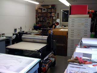
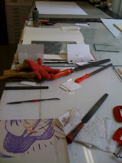
The studio.
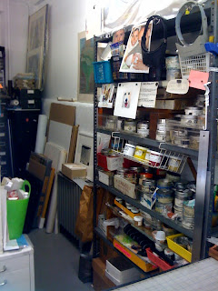
Some ink and other supplies.
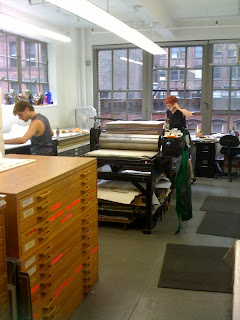
The studio.

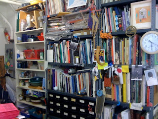
Kathy's Library.

One of the plates I was working on.

Images of the studio in NYC.

This week with Kathy, I prepared zinc plates for printing. The artist that belonged to these plates is Marshall Arisman. Marshall is very worldly, he has written a few books, he is an illustrator, painter, and writer. He is very graphic and is currently making images of war. The titles of the two series are Primordial Light, and the second is Ayhavasca series. The Primordial Light is about children strapped with bombs going to war. The Ayhavasa is about humans transforming into animals. There are eight plates; this project is going to be an addition of 160. In preparing these plates Kathy taught me some useful techniques that I will use in the future the next time I have an etching project.

I was also able to explore the library she has created in the studio and do some research on other techniques. The one that I am most interested in right now is soft ground etching. It is a hard ground mixed with a specific wax and you can press objects into it to create an image. I was also able to research the history of etching and how printmaking moved from adds to art

Designing in New Jersey

The library.
Some current projects.
My desk!


The other internship that I am doing in interior design has been equally exciting! I have worked on many different projects, such as learning about the brand essence of Ramada, Wyndham, Super 8 and Hawthorne Suites. When you create a brand essence in a hotel, a designer has many things to think about: who is going to be staying in this hotel, how long will they stay, what do we want them to remember about their experience, how can we demonstrate this through the furniture, wall coverings and other aspects of the hotel such as the front desk. All of these aspects need to be taken into consideration. This process has been very interesting. It has shown me the business side of interior design for a large company.


Wednesday the 23rd, I went to an offsite visit with the design team to visit a fabric company’s warehouse. This was so interesting, we were given a tour and shown how their products were made from beginning to end. This showed us their quality of work and how quick their turn around time was for their product. This trip was a great experience; this internship is exposing me to so many different aspects of the design industry.


Thursday the 24th, I was able to go to a trade show in NYC called the NEWH trade show. This was so exciting! George (my boss) knew everyone there so I was able to meet all different types of creative people. There were vendors that worked with mosaics, fabrics, bedding, bathrooms, indoor furniture, outdoor furniture, anything you can think of that goes into the decor of a hotel. This show was so much fun and educational. I was able to see and feel products in person and each vendor told us their process and how they were working hard to be environmentally friendly. I learned a lot about what makes certain materials quality materials and how important it is for some of these products to be made domestically. Wyndham Worldwide is doing their best to have green products in their hotels, and it is our job to learn how and where these products are being made before we use them in our design.


Last week the design team and I spent our time having the vendors come to the office to give us samples and spend more time with us teaching us about their product so that we could possibly use them in future projects.


I am excited to see what the next weeks bring!

Monday, July 5, 2010

Printing with artists!

These past two weeks have been packed full with activities. The last two weeks I worked with Kathy in printing two different artists work. One artist was David Collins. His work was about place and time and he was able to make his prints look like collages, when they were just ink on paper. He did mainly mono prints and had many different elements to them. He worked fast and pumped out many prints. I loved that he used long and thin rectangular paper, this size paper is my favorite to work with.

The second artist I worked with was from Japan named Madori Curtis. Her work involved, etching, collagraph, chine colle, and another techniques that I have never seen and I believe she made up. She would ink up pieces of plastic and put them directly on the print only after the second time through to create depth with another element of color. Her work was about music and each print contained calligraphy from and ancient Japanese book.

These past two weeks have been great I have leaned a lot about the possibilities of printmaking and the different ways you can addition a print. I am leaning about artists proofs, original prints and additions of that print as well as an archiving system.