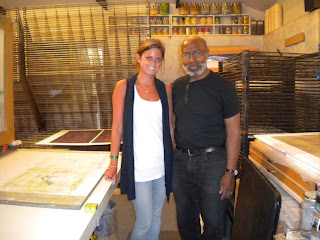
This landscape of a picture I took in Brazil uses a technique unique to Lou. In a given stencil/shape, instead of creating a new stencil, he slowly paints out areas to create a more blended shading technique. So each mountain range was a separate stencil. I would print it once with the lightest color then paint a thin line on the top of the stencil. I would print it again with a slightly darker color, then paint another line on the stencil. This process would be repeated until the entire shape is shaded.
Wednesday, August 25, 2010
my prints
This landscape of a picture I took in Brazil uses a technique unique to Lou. In a given stencil/shape, instead of creating a new stencil, he slowly paints out areas to create a more blended shading technique. So each mountain range was a separate stencil. I would print it once with the lightest color then paint a thin line on the top of the stencil. I would print it again with a slightly darker color, then paint another line on the stencil. This process would be repeated until the entire shape is shaded.
Friday, August 20, 2010
Final Thoughts
So I finished my internship with Lou a couple weeks ago and I’ve had time to reflect with my time with him. Not only did I learn almost everything about silkscreen printing but our conversations about art really opened my mind. When I would be printing Lou would occasionally wander by and critique my work and sometimes it would turn into a deep conversation about art. The conversations reminded me of our discussions that occurred in Art315.
Art isn’t so much mastering the technical. It’s being able to produce something surprising, new and interesting. Art should be exciting. The illusion of being perfect so even if it isn’t technically perfect, it’s about being exciting and surprising.
It’s amazing to watch Lou’s creative process. I came in one morning and there were two new prints on the drying rack, which looked new and different. Later that morning he added white to them and they change completely. Sometimes they change in a good way and other times you know he needs to keep going. The process of Lou creating his monoprints, layering ink like Pollock, can take days or weeks. He’s always interested in the opinions of others to help him make decisions on the direction of his prints.
Lou admitted to me that he enjoys creating abstract art more than representational. It’s more enjoyable to him but there’s still something beautiful about the representational. He thought he was sending me mixed messages about abstract vs representational since he was teaching me how to render perfectly while he was creating abstractly. I think there’s a progression with an artist that starts with the mastering of the representational and over time it evolves to abstract. Mastering the medium and being able to render something perfectly makes the artist and the art legit. There’s something the artist has to achieve to release the creativeness for the abstract. Abstract is creating from the mind and emotion. There is a progression of conquerings an artist has to go through. Perfect rendering that slowly loosens up and breaks down to abstraction.
I have found that silkscreen printing is an art for the engineers. It takes more planning, organization and sometimes math. Technical skills need to be acquired. Patience and perfection are required. One cannot get lazy or sloppy (or it defeats the whole purpose of an edition). With the rigidity of this art, it’s surprising how loose and painterly/drawerly you can make a print. Some really beautiful things can start to happen. Its far from the graphic screenprint posters your used to.
“I’m fiercely proud of you for doing this… we’re goning to be friends for life” Lou
Thursday, August 19, 2010
My final weeks
Thursday, August 12, 2010
Revelation!
Hello all,
Valerie also set me up with one of her friends who also has a studio in the quad of buildings that Valerie works in. The warehouse is called “The Can Factory,” it was an old bottling factory that was converted into studio spaces for artist and musicians. It is very cool to walk down the halls and see the names on all the doors. They have some very successful and well known artists working there. In wondering one day I saw the name Tim Hyde. I wrote a paper on Tim for a Contemporary Art class! In a weird way seeing his name hit me. The artists that we see in museums, galleries, etc. do work and create like the rest of us. They aren't so removed from us and society. I know that is weird to say but I already had a connection to that artist and his studio is down the hall from the artist I'm working for! It was odd to see the name of someone whose work was on display in The Philadelphia Museum of Art in such a close proximity to me, give it up from Brooklyn!! Sometimes you think artists are untouchable or unreachable or live and work in some remote area or even another dimension. It was cool to work near someone so successful and so famous and so close to home. It almost made things seem reachable, or not so foreign. I think seeing his name gave me a more personal experience of art in general because it brought me closer to the creative process. For art papers you write about the art that you are intrigued by, attracted too.
You write about a person, a name that other then his art you know little about. Reading a biography does not allow you into the personal live, the creative process of the person. I like that seeing Tim Hyde's name on the door still has a bit of mystery behind it. I know where his studio is but I do not know what is inside. I feel connected but I still feel distant. The doors are big metal doors, you cannot see in. It was cool to still wonder about the man behind the curtain but feel connected to his workspace. It is also cool that I saw his work in Philadelphia, close to Delaware, and his studio, very close to home. I had a revelation in away, just that these famous artists are real and can pop up where you least expect it.
Friday, August 6, 2010
PIXS
These are actually inages from the conference. This is of one of the many high text and jam packed hallways.
.
This is a picture of the main entrance to the Hilton. I was really suprised when I came up to it. I did not now it was such a big thing. There were over 500 participants. Among other things like the huge house they had keynote speakers and book signings. The Kardasian dad was there, BRUCE! Also one of the Real House Wives of Orange County, not NY, crazy.
This is of our work space. That's Naomi. On the other side were faux
cabinets. it really did look like a kitchen.
BLOGher- You Go Girl!
Well fellow UD bloogers, do I have a story for you. I worked a huge conference today in the Hilton on 53rd and 6th for female bloggers, caller BLOGher! There were so many different women form all across the country, young, middle aged, some kids, some dogs in bags. Most were dressed pretty normally, the reason why I say that is because some were in Wonder Women outfits and some were in tutus. A lot of women has shirts that reped there blog sites, most sites were for mommys. The women blogged about the good, the bad, and the ugly of motherhood. I met many interesting characters who really inspired me to not be intimidated to write my mind. The slogan for the conference was "Life well said." I thought that was articulated pretty well. One of the great features of the conference was blank speak bubbles where the women could write what was on there mind. Some were inspirational, some were funny, and some were down right raunchy. You go girl!
With my many projects and art gigs this summer you are probably wondering how in the world did she get involved in that or better yet, what the F@* is she talking about. I will try and lay it out for you as best I can. Lord knows I go on tangents thinking whatever is on my mind will come across on paper...I'm working on it! Anyway back to my amazing adventures in midtown, here is an explanation for my random yet exciting and quirky participation in The 2010 BLOGher conference. One of the big sponsors for the conference is Procter & Gamble. One of the main companies of Procter & Gamble is Bounty. Bounty is one of the main sponsors and partners with Rush Philanthropic Arts Foundation, for which I work for. The conference had a huge fake house set up in the main ballroom where all the corporate sponsors ran little tutorials and gave out free samples yayy!! The products and companies were divided by rooms, Bounty of course was in the faux kitchen. Myself, another intern along with visiting artist Naomi Blume were there on behalf of Rush Kids. Rush is part of Bounty's "Make a clean difference program." Just a little side note, Bount is no longer "The quilted quicker picker upper." The program is meant to spur creativity. The company does not want the stress of a mess the stifle the artistic process. Bounty and Rush published a cute little pamphlet with fun activities for parents to do with their children. Myself and the girls were there to do one of the interactive projects with all the fast and furious female bloggers. We focused on a cheap, fun, and easy project called Food for Thought. For the project we made collages out of food packaging labels. The interns actually collected the images on line, but the booklet instructs the consumer to collect labels for a week or so then sit down and create. We were selling a product while making art, how commercial!
It was really cool to be on the Procter and Gamble team, seeing the PR side of things and making art. I was really surprised at the size of the conference. I liked meeting all the women. The best part was seeing so many women carrying bags and bags of free samples. Gotta get it while it's hot I guess. I am going again tomorrow for part duex. Will keep you posted. Blog on, live well and prosper...Life well said.
Monday, August 2, 2010
interior design!
These past couple of weeks at Wyndham have been very exciting. We are working hard for a conference in September. As I have mentioned before, we are revising the brand essences for the core brands of Wyndham. Each week we have sat down and discussed a particular brand. I have learned a lot about how we, as designers, need to cater to the franchise owners, as well as the consumer. We need to get the best price point for the owner with a unique design that will differentiate this Wyndham brand from its competitors. We also need to think about being green and using products that are recycled. As well as creating a space for the guests that creates a positive flow of energy throughout the hotel.
I have been involved in the Super 8, Ramada, Hawthorne Suites, Wyndham, Wingate, Tryp, and Days Inn design meetings. We have worked on marketing, layouts of the space, fabric colors, pattern choices, furniture and brand defining elements. Each week we get closer to where we need to be for the conference to show the franchisee owners what design direction their brand is heading in.
Last week I learned a lot about our newest brand, Tryp, and what its DNA is in the Wyndham family. I am very excited about this brand, it will hopefully be in all major cities in the US. It will revolve a lot around socialization, food and lots of energy based on some Tryp hotels that already exist in Eroupe.
For one of the brands I had the opportunity to design a tile that could possibly be used behind the lobby desk of a particular hotel in L.A. I abstracted the Wingate emblem to make it look like a design at first but at second glance you can tell that you are at a Wingate.
The designers and I have had the opportunity to have a lot of great vendors come in these past few weeks. One vendor had mirrors with TV’s in them, glass blown pieces for lights and some great options for furniture. Recently we have had a few tile vendors in and the creative solutions to tile that people are coming up with are crazy. The one that sticks out the most to me is the new liquid tile. It has a hard exterior but when you step on it the liquid in it moves based on the pressure from your foot. It is mesmerizing and it adds interest to a space, plus it is a great distraction for kids.
Other tiles that I am drawn to are these tiles that are created to mimic hardwood floors. It gives you the durability and affordability of a tile but looks like hardwood flooring which is more expensive and less durable.
One of the projects that I am currently working on is three specification books for the new Wingate designs which are, spring, summer and fall. The spec book contains everything in a hotel. From vending machines to the type of lock on the door, these books are filled with information for that hotel owner so that he can get the best design.
Just as a reference, Wyndham Worldwide is located in Parsippany, NJ. George Scammel is my superior and he is extremely well known in the world of design. He has owned his own business, worked for Disney for ten years in design, designed furniture, been in construction and has always loved hotel interior design. He is extremely inspiring and has taught me a lot about what it means to control a space that people will interact in.
Sunday, August 1, 2010
City Printing
These past few weeks in the city are the weeks that I have learned the most from Kathy. Here are a few things I was able to experience and lean about….Methyl Cellulose and its powers! It is German archival glue that makes Chine-collĂ© flawless. I was also excited to find a new type of plate called a styrene plate, which are compressed packing peanuts. This is the plate that Midori Curtis used in her prints. It is white and feels like plastic but you can cut it up easily and you can get some great colors on it, the application of ink is smooth.
I was able to do some research on Mezzo Tint, which creates a middle tone in black and white prints. The book I used was by Carol Wax. I also got to see some of her personal prints that Kathy purchased from her. She had a mezzotint of an old fashion typewriter; this print looked so close to a photo it was memorizing. These images look so realistic because of the shadows and middle tones that are created. Carol called Mezzotint a product in “The age of Reason.” You pre-pare the plate by using a rocking tool, which makes the metal of the plate stand up. Next you go back into the plate with a burnisher and work towards an image by putting white into the image. This process introduces patches of light, and adds an immense amount of depth by creating all different gray tones with different uses of pressure.
This Thursday and Friday I helped Kathy prepare for an upcoming show that she was asked to participate in. I would scan in her prints and make adjustments in Photoshop and teach her about some of the options she had in Photoshop with printmaking. She is letting me be her collaborator in her show! This is so exciting, anything that I helped her with she had me sign and date so I could get credit for it. Her pieces that I was collaborating on with her were based on her trying to make her own art and not copy the artists work that she has been printing for lately. She has been influenced by the work she has been printing, but that work has not been her own work, so this series is about he finding he art through process.
Next week Kathy is going to teach me embossing in printmaking and from what I understand you can do it in many different ways. Crible, which is the hammering of holes, is a form of embossing.